
Few hours to imagine what could be the Hyperloop’s interfaces in 2040.
May 2041, no more trains or planes. The Hyperloop has become the indispensable means of transportation for long distance travel. The Hyperloop network has grown in France and it will soon be possible to use it in dozens of cities to cross the country in a few dozen minutes.
You are selected to join their team of designers. It's up to you to design the interfaces in the Hyperloop and on the platforms.

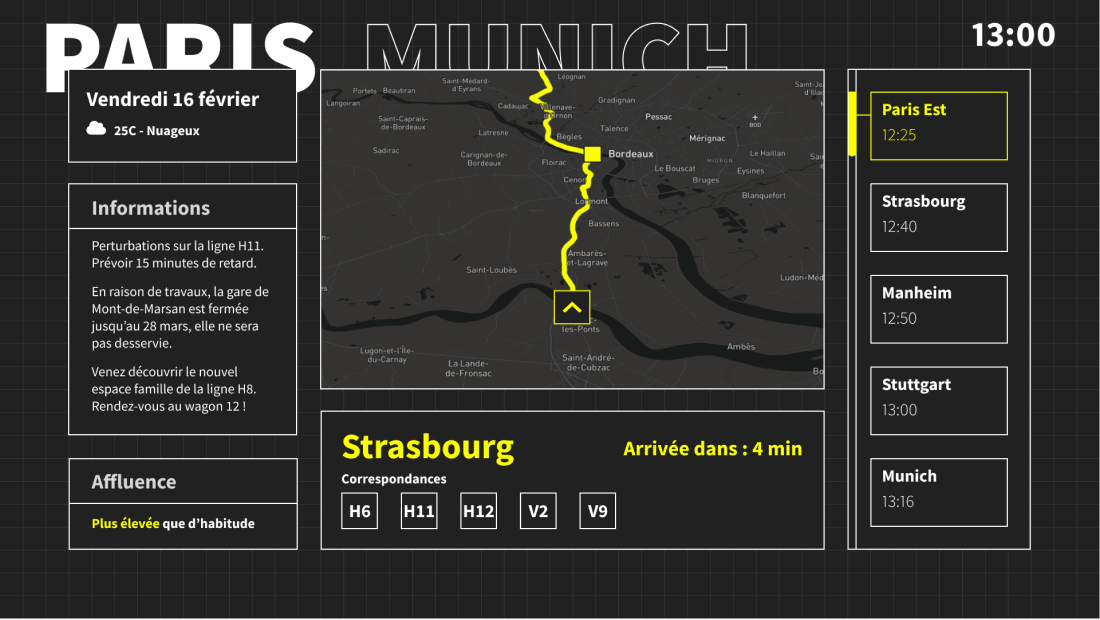
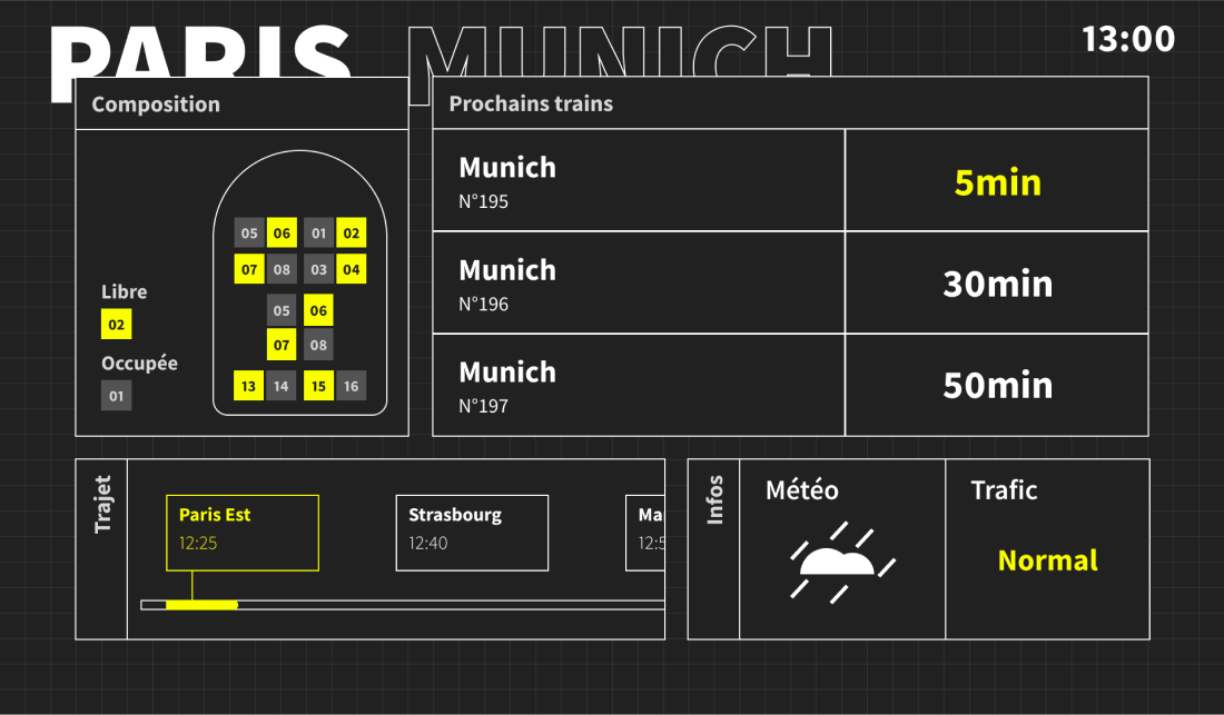
Since the time frame of this project was set in 2040, the choice of a suitable typography was a major objective. We therefore chose an angular and clean font, less identifiable but timeless.
We chose a very sober graphic charter dedicated to the interface. To do this, we used pure black, pure white and a color of highlight, a very flashy yellow that contrasts very well with the black.
The context being the creation of interfaces for the hyperloop, the size of the screens is larger to allow to be read at great distance. Thus, the Ux must follow this objective.
List of stops

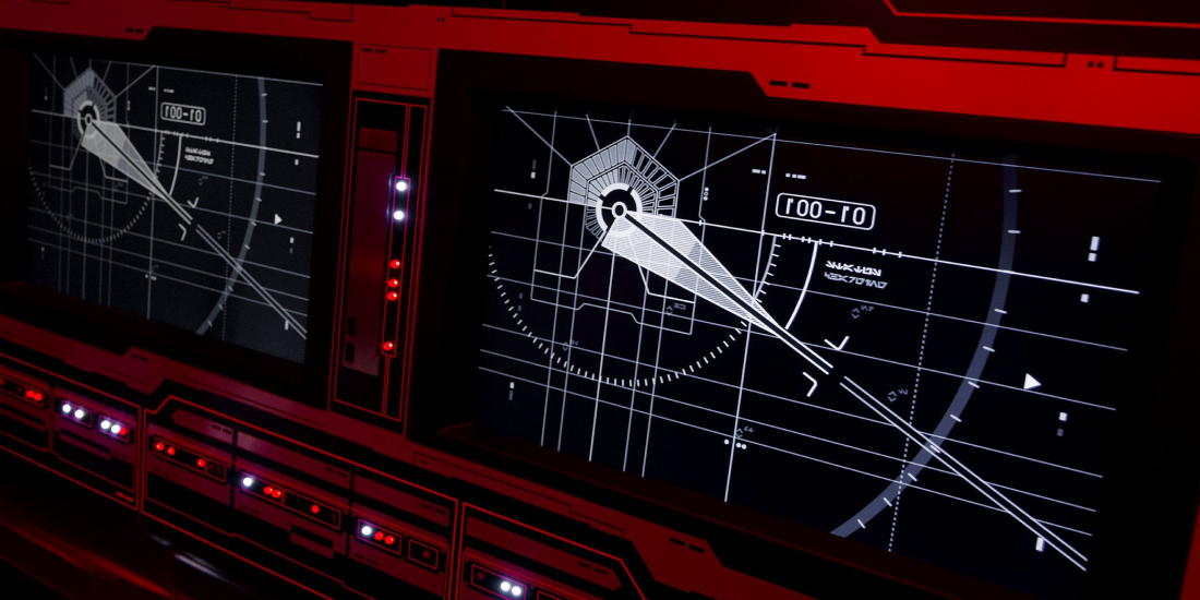
It is very difficult to predict the interface design in a few years because trends come and go regularly. As we often see, old fashions come back into fashion. So, we decided to play on the nostalgia and modernity string and create a style that could be close to the interfaces we saw in Star Wars. A background grid, black and white interfaces where information is separated in specific screens.
UI & HUD star wars example

Informations in the train

Informations on the platform
