
The community of mutual aid between cyclists against bike theft.
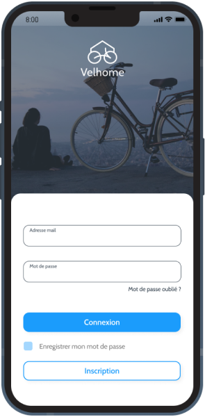
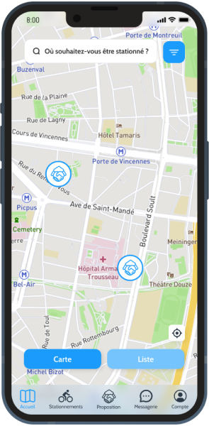
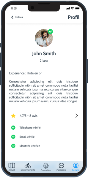
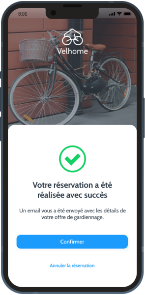
Velhome is a non-profit platform run by enthusiasts that allows cyclists to park their bikes safely in private homes. I participated in the creation of the art direction and the design of the future Velhome mobile application, from the ux to the ui, through user tests and follow-ups with the client.
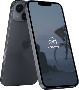

Velhome had a very dated logo. Our goal was to refresh the brand image by moving away from the very illustrative and busy logo already in place to a more design-oriented, modern logo composed of a single line. The goal was to find the bike and the house, the two main components of Velhome.
We needed to find a modern font, adapted to the mobile and quite sober. So we turned to cabin, a simple, effective and still recognizable typography.
Here are the colors we have chosen for this graphic redesign. Velhome had two colors which were blue and orange. We decided, for more clarity and graphic consistency, to remove the orange for this application and stay on something sober. To do this, we worked with blurs, and CTA of our main color. This graphic choice was a great success during the user feedback.
